The Extractive Industries Map of Mongolia is a web-based, publicly-accessible, interactive mapping application that is focused on the extractive industries of mining and oil. Using this website, policy makers, citizens and government officials can explore the relationships between mining and petroleum activities, revenues and socioeconomic conditions by creating and sharing their own maps or even downloading the underlying data. This document provides an introduction to the mapping interface and instructions on how to use the many features of this application.
Click here to download a PDF version of this how-to guide.
Click here to go to the map page.
CONTENTS
OVERVIEW OF THE INTERFACE
GETTING STARTED: HOW TO USE THE INTERFACE
Navigating to your area of interest: zoom and pan
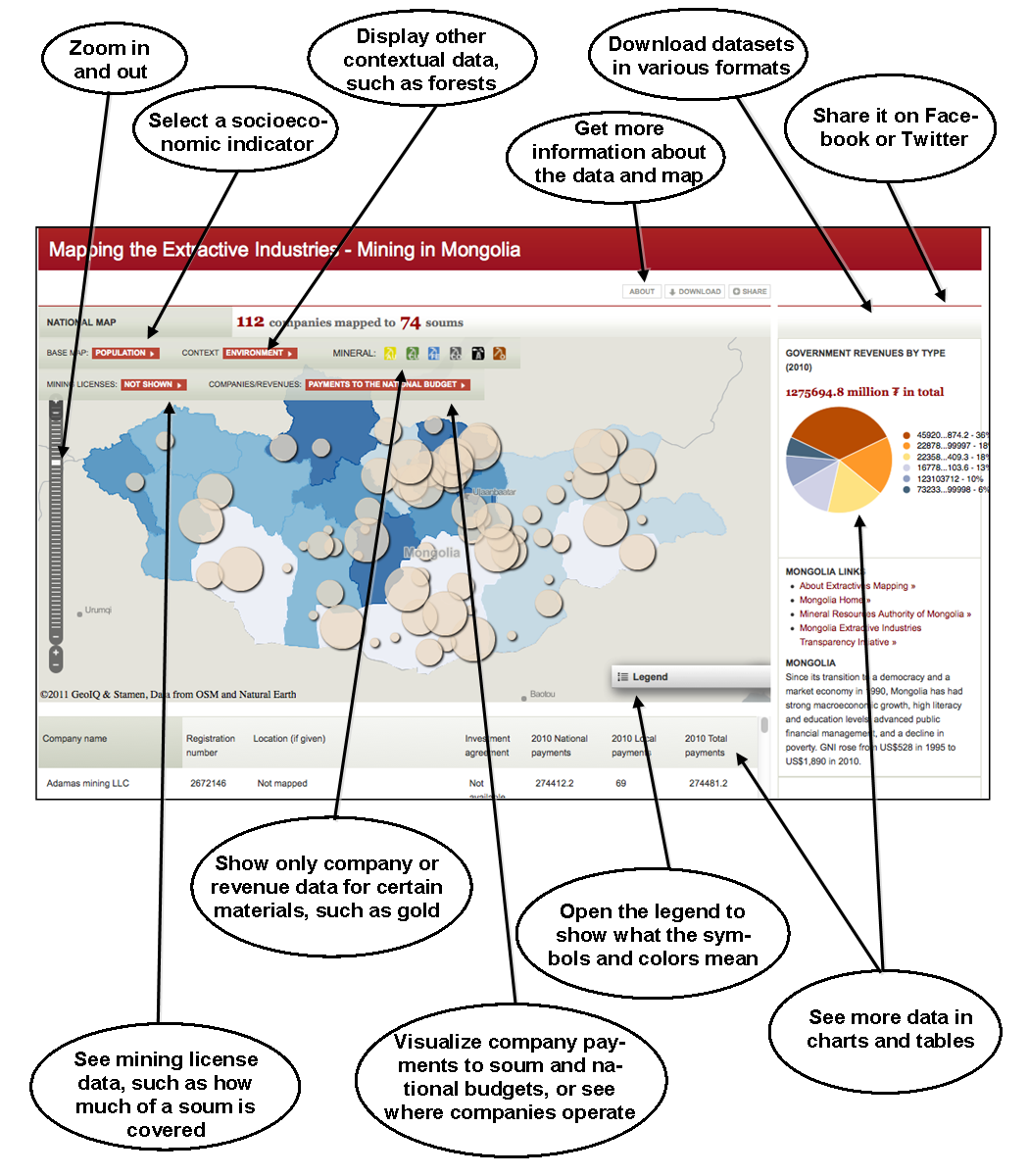
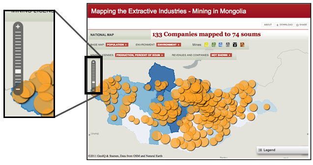
You can move around the map by clicking and holding the cursor and dragging the map until you are centered on your area of interest. You can zoom in and out in two ways. You can use the mouse wheel or scrolling portion of a track pad, or you can use the tools in the upper left of the map window. On the zoom bar, you can click the “+” button to zoom in, the “-“ button to zoom out, or you can grab the white bar and slide it up or down.
Displaying the legend
The color or size of items on the map often corresponds to a particular piece of information. The legend tells you the numbers to which those colors and sizes correspond. You can open the legend by clicking on the bar labeled ‘Legend’ in the lower right of the map window. If you can’t see all the items in the legend at once, you can use the slider bar on the bottom of the legend window to see all the layers.


Turning layers on and off
Depending on what data you are working with, there are several different ways to choose what to display. The table below shows you how to work with each group of menus. By using the menus highlighted below, you can choose different ways to display the data about mining and petroleum. You can look at soum-level summaries of license data or payments, or highlight where companies operate. When displaying quantities, the size of circles is proportional to the data. For example, if looking at local payments, a larger circle means larger payments.
You can visualize statistics about mining and exploration licenses, summarized by soum, or you can view information about how much companies reported paying, where they work, and soum-level summaries of budget revenues from mining activities. You can also display only the minerals you're interested in, such as showing just petroleum, or only copper and gold together. You can also adjust what socioeconomic indicators are shown on the basemap.
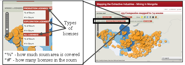
License data: Use the dropdown menu labeled mining licenses on the second bar above the map window to display statistics about license at the soum level. You can view statistics for active production, exploration or all licenses, and this data can be displayed as a percentage of the soum area or the number of licenses overlapping the soum. The size of the circle represents the data, so the bigger the circle, the more area of a soum is covered. You cannot display license and company/revenue data at the same time.
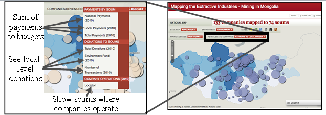
Company and revenue data: Use the dropdown menu labeled Revenues/Companies to show summaries by soum of how much is paid to local or central budgets, or to highlight the soums in which a company is operating. You can also see the donations made by companies to the local level. You cannot display license and company/revenue data at the same time.
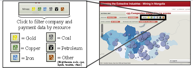
Filtering data: When viewing revenue or company data, you can choose to only look at certain minerals, such as gold or copper. Click the picture to turn off the minerals you don’t want to see.
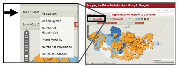
Indicator data: Use the dropdown menu labeled “BASEMAP” on the top left of the bar above the map window to select which indicator data to show on the map, such as infant mortality rates or population. You can only select one indicator at a time.
GETTING MORE DATA ABOUT A POINT OR SHAPE
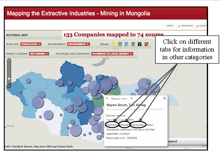
Most of the features in the map have a lot more information stored than what is shown. To look at this data, simply click on the feature your interested in, such as a district or a mine. The window that pops up has different groups of information under each tab, such as “Payments”, “Minerals” and “Companies” for soum summaries of payments. Where possible, links to additional information and other websites are provided.
WHAT INFORMATION WAS MAPPED
The following datasets were compiled for this mapping, and additional information about these data can be found at the About page.
Mining information
• Amount of soum area covered by production and exploration licenses
• Where EITI reporting companies operate
• Number of licenses in each soum
• Investment agreements (where available)
Financial data
• Company payments to local budgets (2010)
• District mining revenues received from central government (2004-2008)
• Company payments to national budgets (2010)
• Company registration numbers
Socioeconomic indicators
• Aimag population
• Aimag infant mortality
• Aimag unemployment
• Number of physicians, by aimag
• Number of households, by aimag
Contextual data
• Special protected areas
• Forest areas
• Soum boundaries
SHARING YOUR MAPS
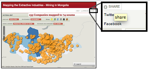
Right now, you can share your maps in several ways. You can share your map is to post it to Facebook or Twitter. Simply click on the Share dropdown menu and select how you want to share your map.
In the future there will also be options to download an image of the map or to print it directly from the website. In the mean time, you can take a screenshot of the map and copying it into Microsoft Word or PowerPoint. To do this, go to your map, and press “Alt+Print Screen”, then go to Microsoft Word or PowerPoint and press “Ctrl+V”. You can now save or print your map.
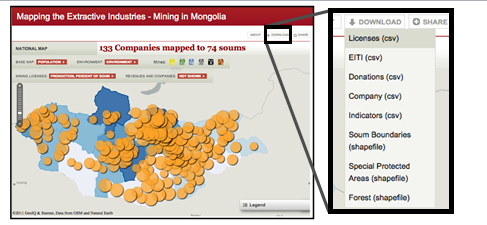
DOWNLOADING DATA
Most of the data shown in the map can be downloaded directly from the website. Data is available either as an ESRI shapefile or as a comma-separated value (CSV) file. Shapefiles contain spatial information, and can be directly added to GIS programs such as ArcGIS or to online mapping platforms such as www.geocommons.com. CSV files can be easily opened in Excel, and include a set of latitude and longitude points for each data point. This way, you can look at the data in a table using Excel, or you can upload the CSV file to another mapping platform, such as Google Earth or GeoCommons and use the latitude and longitude fields to tell the program where to put the points. This way, you can share this data with others and put it into most any platform you want.
MORE INFORMATION
If you want to learn more about where the data came from, how it was collected or what was done to process and prepare it for the map, much of this information can be found at the About page for the Mapping the Extractive Industries project.
In addition, we are hoping to receive feedback about what would make this application more useful and relevant, so please feel free to contact us at maps@worldbank.org with questions or suggestions.